Brand
DESIGN
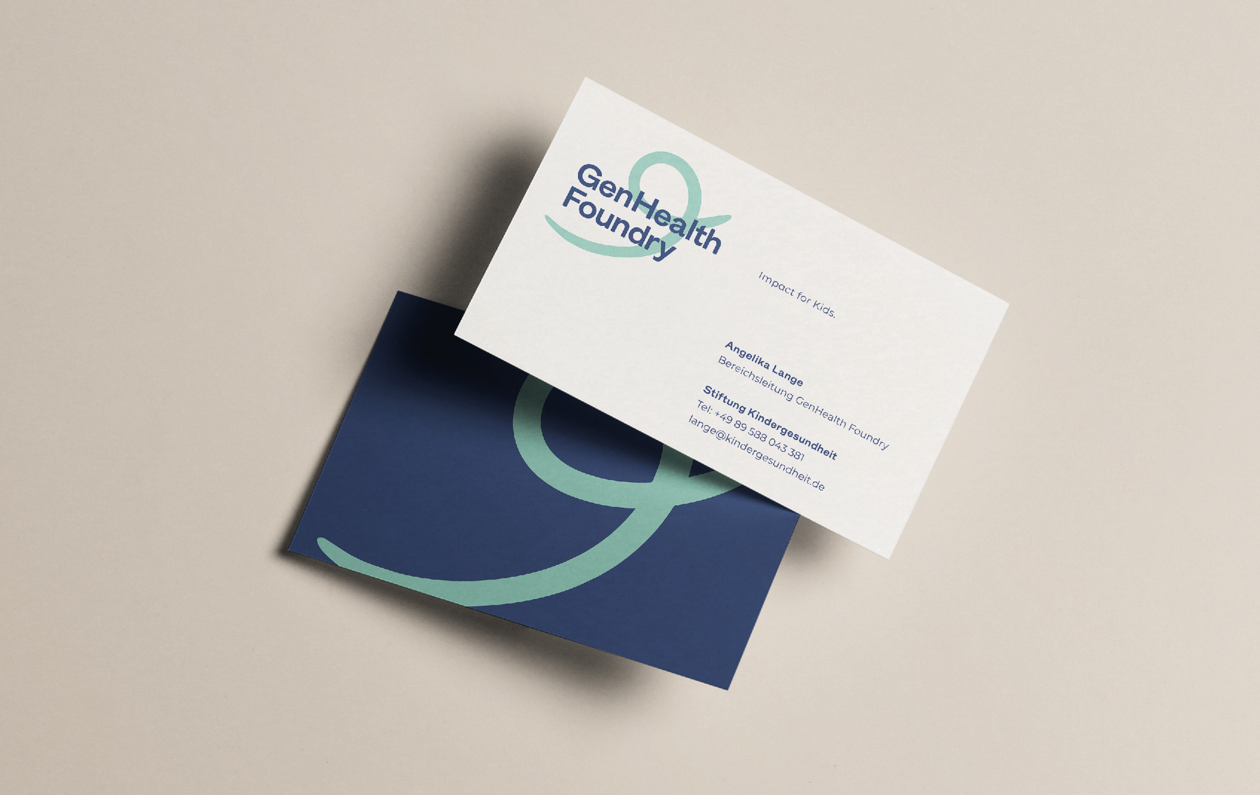
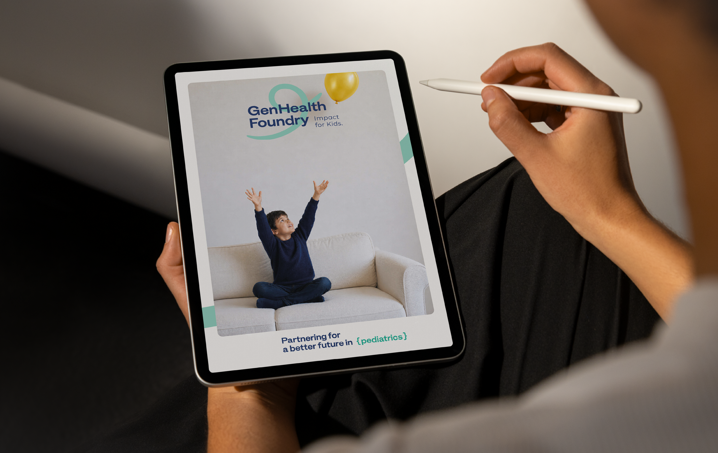
"Stiftung Kinder Gesundheit" (Children's Health Foundation) is establishing an Innovation Hub to promote new and innovative ideas. For this purpose and in collaboration with Studio Gramisci based in Munich / Germany I designed and visually developed a complete brand system.
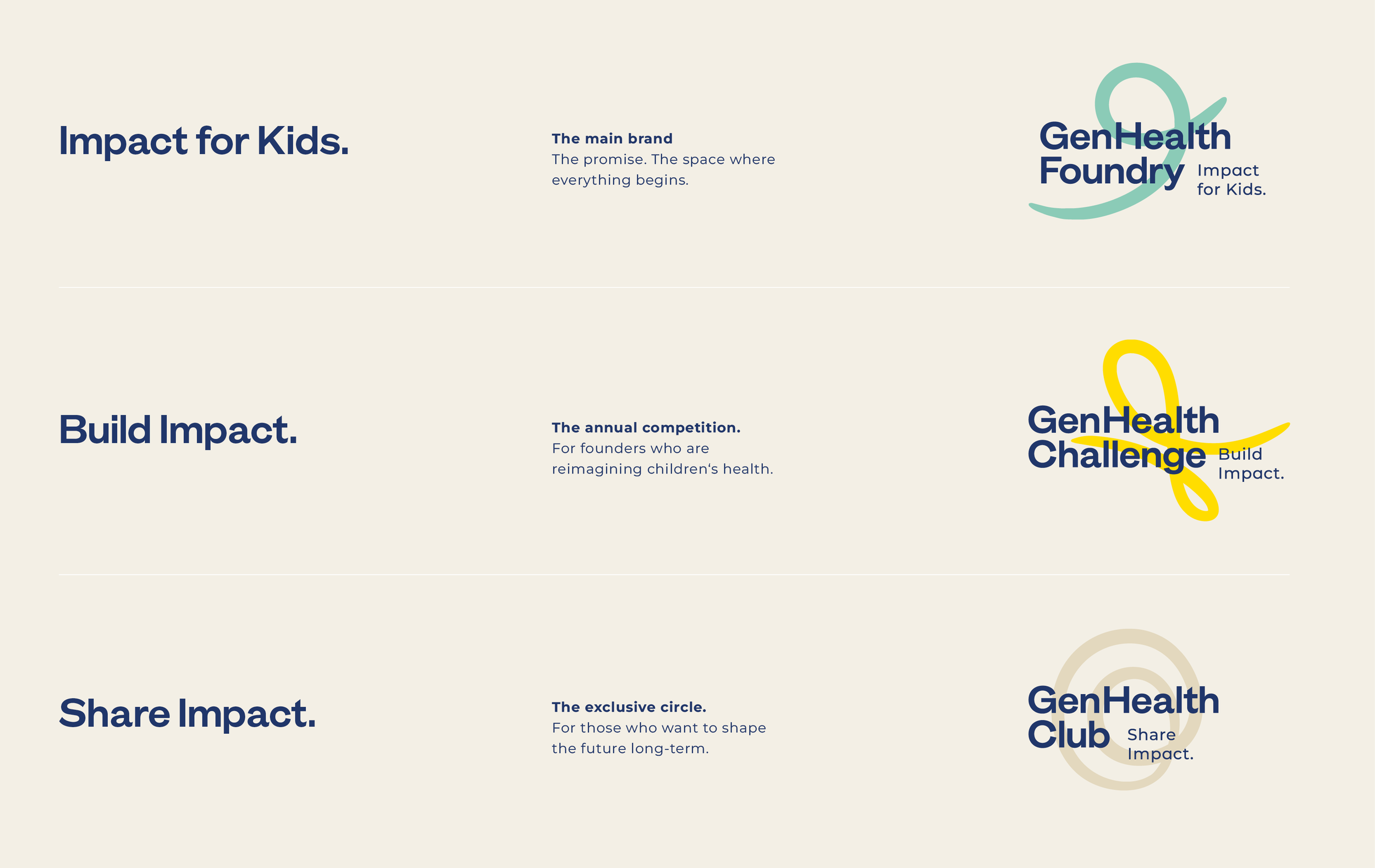
Brand Level & Meaning
GenHealth Foundry –Creation & Action
GenHealth Challenge –Competition & Ideas
GenHealth Club – Premium & Immersion/Depth
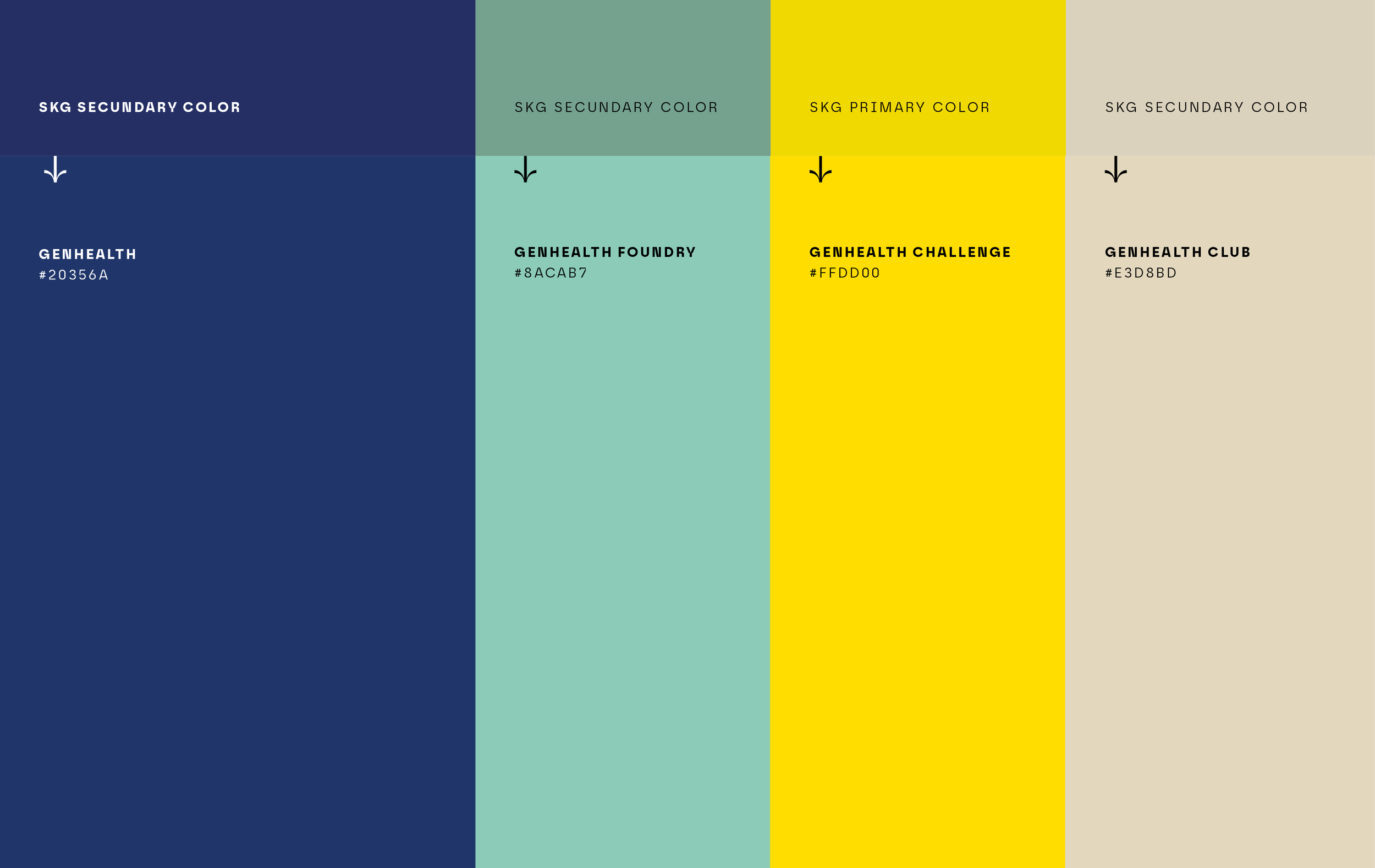
GenHealth Color World
Derived from the SKG color system, further developed independently for the InnoHub context. Each color is firmly assigned to a specific brand level (tier).
Confident Wordmark Typography
Typeface – GT Era Bold Display, in dark blue
Character – Handcrafted, characterful, unconventional
Feel – Charming, warm aesthetic
Distinctive Icon Marks (Brandmarks)
Open, calligraphic forms
Strong character and originality
The 3 icons represent the Foundry "journey":
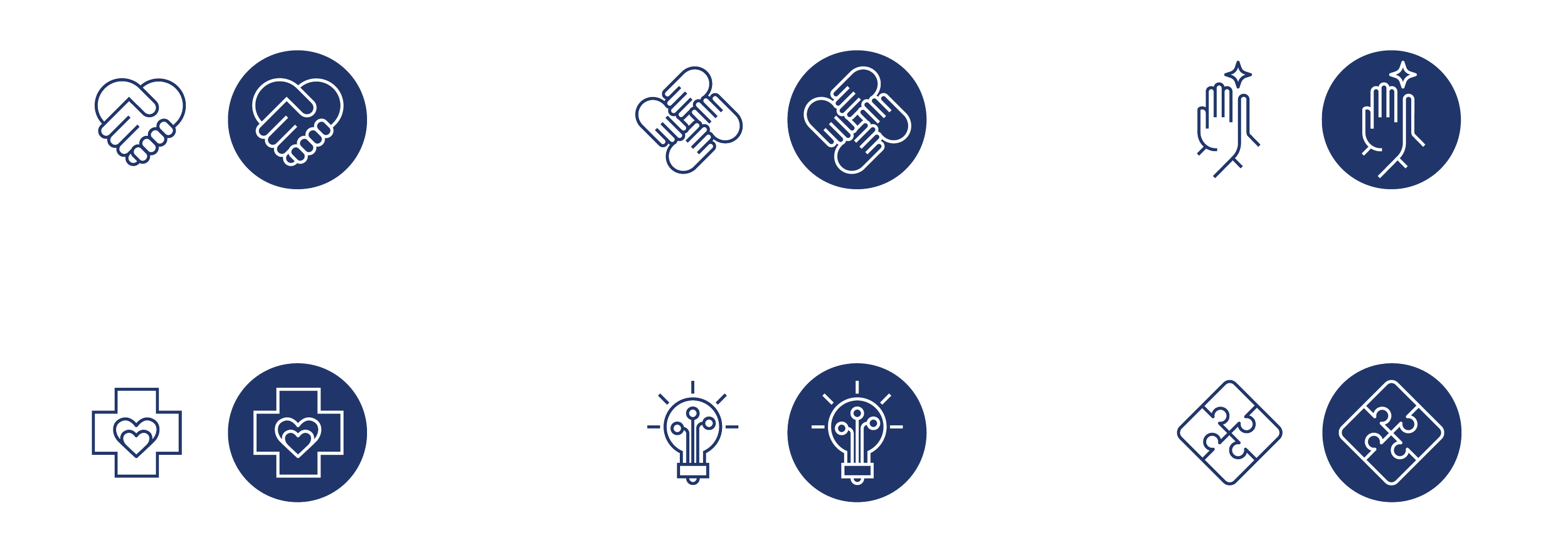
Pictograms
Clear pictogram language, aligned with the typography. Moves away from a straight-line style toward more dynamic, flowing (swung) lines.
This reinforces the logo's presence and distinctive identity
2026
Munich/Germany
In collab with Studio Gramisci