Brand
DESIGN
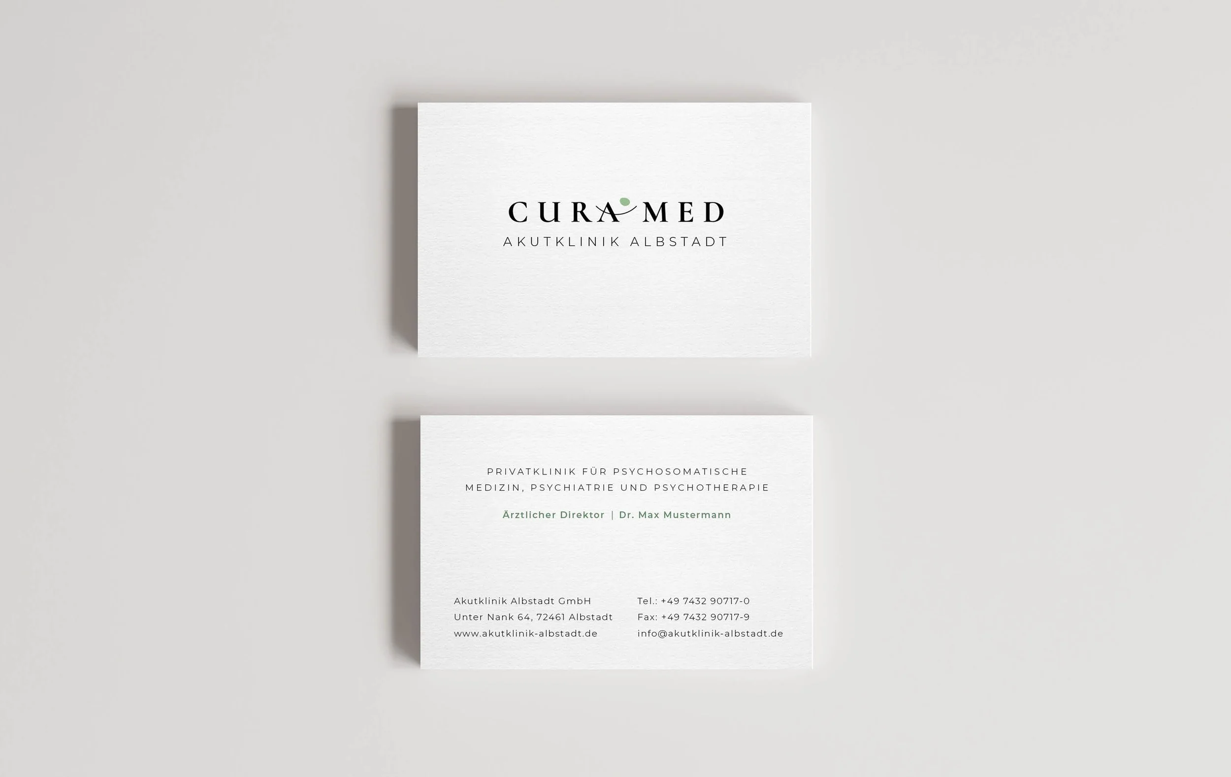
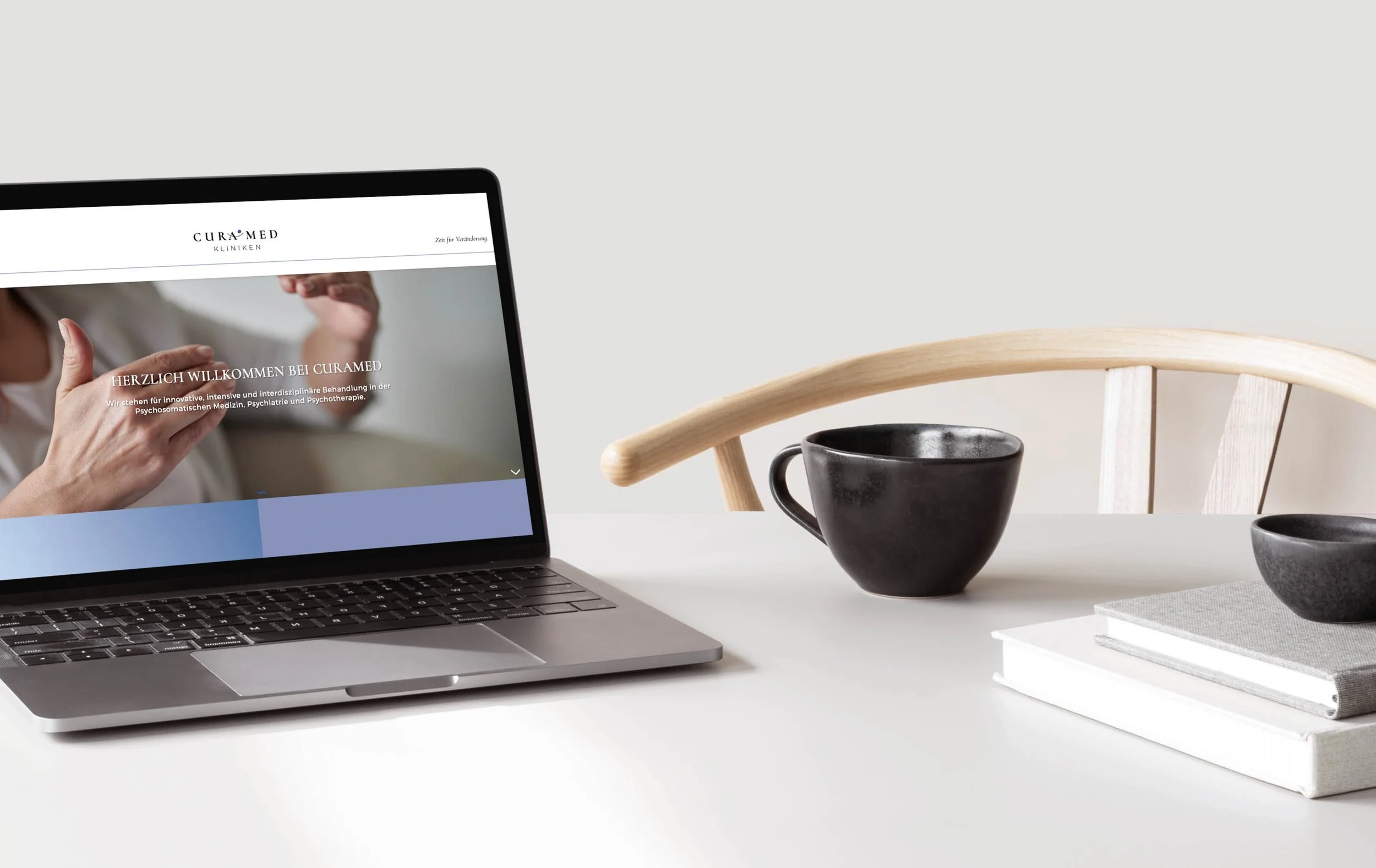
Corporate Design for innovative, intensive and interdisciplinary clinic with treatments in psychosomatic medicine, psychiatry and psychotherapy. In collaboration with Studio Gramisci based in Munich / Germany.
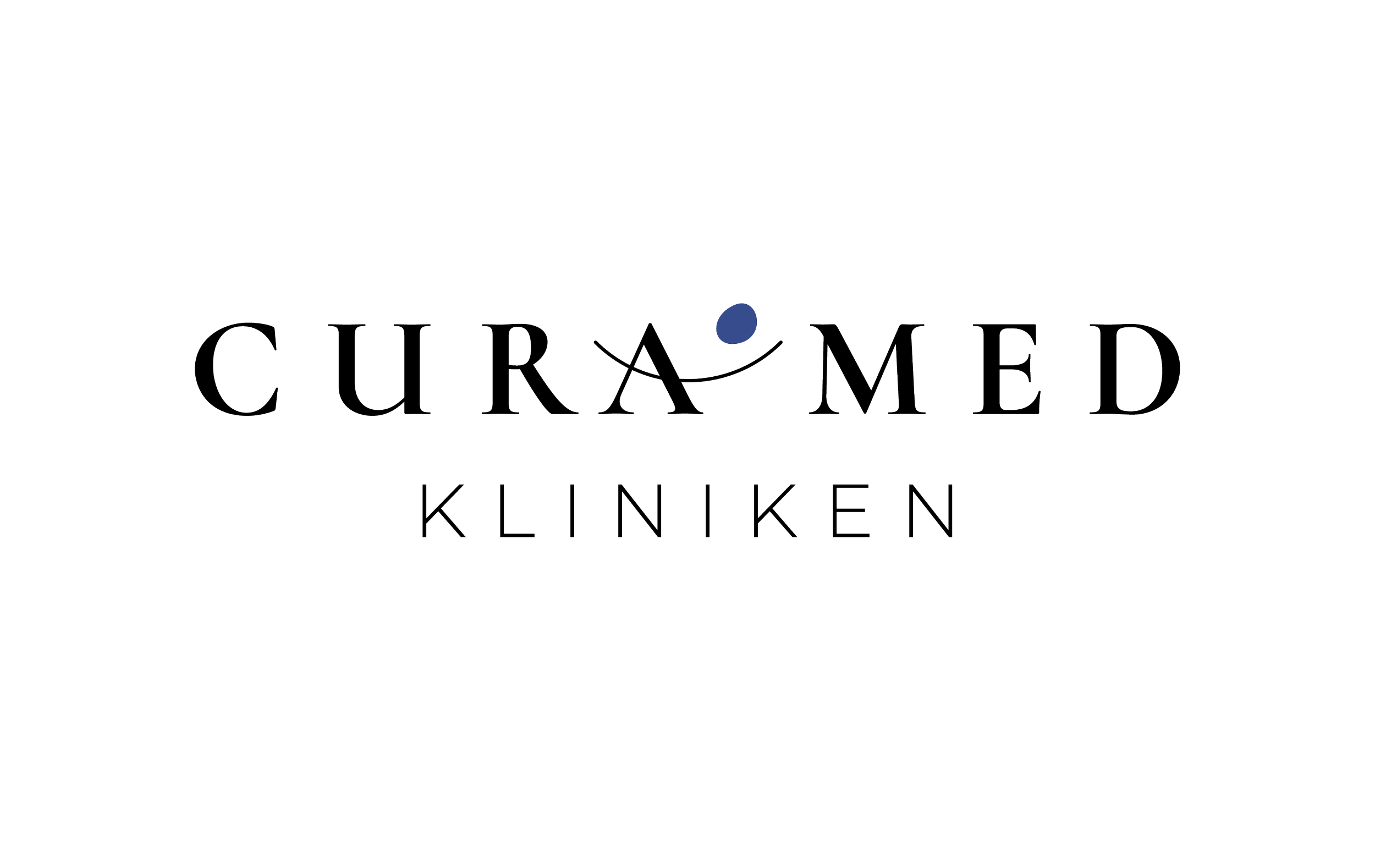
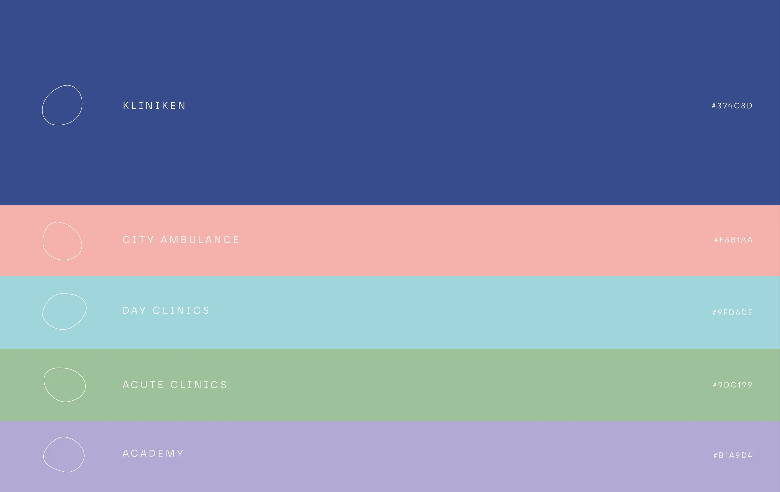
In order to give the name of the clinic a classic appearance, I deliberately chose serif typography. The horizontal line of the A is intended to symbolize “being supported” in the clinic while the nugget symbolizes the human being. The different colors of the nugget are another aspect that indicates the individual areaswhere and how the clinic operates.
2018
Munich/Germany
In collab with Studio Gramisci